What does a futuristic OS look like?
Kragen Javier Sitaker, 2017-08-18 (updated 2019-05-05)
(6 minutes)
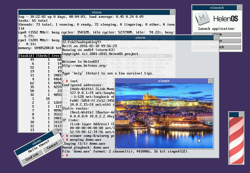
I was just looking at the screenshot of
HelenOS at
http://www.helenos.org/chrome/site/screenshot.png, and it occurred
to me that it’s a bit clichéd.
Hobbyist OS clichés that look outdated
I mean, the reasons HelenOS is
supposedly interesting aren’t capable of being shown in a screenshot
at all. But here’s a sort of checklist/bingo card of things that look
“outdated”:
- Fixed-width fonts everywhere.
- Big title bars on all the windows.
- A rotated rectangular window.
- Flat-shaded buttons (and everything) with no texture and no
gradient. I mean, Arena had texture on its backgrounds
in 1994. All our displays are TrueColor now. No physical objects have
no texture and no gradient.
- ASCII-art tables (in the top display).
- A restricted color palette that nevertheless includes a diversity
of saturated colors.
There’s a lot of hobbyist-OS work that kind of looks like that
actually. I’m looking at a TempleOS screenshot that
hits #1, #2, #4, #5, and #6;
it’s mostly fixed-width text on a white background, even
the window borders; of the I think 59 lines of text on the screen,
about 5 (8%) are taken up by window borders and titlebars; the text is
in white, magenta, red, green, dark blue, light blue, and yellow; the
filesystem directory and the hotkey menu are both ASCII-art tables.
(TempleOS additionally has many aesthetic problems: very wide borders,
640×480×16, color boundaries that butt up right next to text and
impair readability, low-contrast color choices, underlining, and a
profoundly ugly font, among others.)
ColorForth screenshots I find have fixed-width text in red, green,
yellow, white, and blue on a plain black background,
hitting #1, #4, #6, and arguably #5.
The Toledo family’s Fénix operating system and Biyubi web browser is
an effort that seems mostly to have escaped this, though it still
suffers from #2.
Oberon suffers from none of these except #4.
Hollywood “futuristic” UI clichés
There’s a separate set of clichés in Hollywood depictions of
“futuristic” user interfaces, some of which are due to constraints of
filming:
- Transparent screens.
- Giant flashing error messages, and more egregiously, non-error
messages: “INTERCEPTING SIGNAL”,
“>>SEARCHING_ALL_LIBRARY_ARCHIVES”, “QUERY COMPLETE”.
- Lots of “cool” slide transitions and animations, including lots of
three-dimensional rotations and progressive delays. Things rarely
just blink into or out of view; instead we have progressive display
on even the simplest of data, such as monospace hex dumps or even
individual people’s names, as if we were receiving it over a
1200-baud modem.
- Bright-on-dark text, but never in monospace except to show that the
user is a data vandal.
- Bright-on-dark vector drawings, including lots of wireframes.
- Radial menus. Radial and circular layouts wherever possible,
really. This is sort of a callback to “high-tech” products of the
19th and 20th centuries made by lathing steel and brass.
- Touchscreens and voice interfaces.
- Lots of capital letters.
- Holographic displays.
- Textures, animation, and translucency everywhere. Incessant
animation.
- Lots of 3-D interfaces and zooming. “This is Unix! I know this!”
- Rectangular grids.
- Great text size variation to focus viewer attention on the most
important part, like that used in machine tool DROs.
- Windows with tabs in funny places.
- Random patterns of dots linked into a Delaunay triangulation or
something similar, all bright on a dark background, maybe with
some of the triangles filled with translucent bright.
- Sound effects, especially square-wave beeps.
- Constant, instant responsivity, even of partial results.
- Lots of primary colors, and things changing color over time.
- Roundrects, perhaps with a bit of rotation.
- Lots of text windows that look more like chyrons than anything
else.
- Gestural interfaces.
- Lots of photos, often with strange clipping paths around them,
often reminiscent of punched cards.
- Visible pixelation and glitches. Things flickering into or out of
visibility.
- Hershey-ish monoline fonts. Old movies often used MCR characters.
- Dotted lines.
- Crosshatch shading (usually light on dark).
- Bright-on-dark displays, especially with cyan glows (the ZnS:Cu
color of an analog oscilloscope screen; sometimes the green
oscilloscope color is also seen). Fairly sparse color schemes,
mostly varying in the intensity of a small number of
hue-saturation settings, usually not very saturated. (ZnS:Cu cyan
is not very saturated.)
- Bright-on-dark color schemes in general.
- Lots of numbers and graphs.
- Callouts, like on a mechanical drawing — with a leader connecting
some text to a point in a drawing.
- Ripples expanding from things.
- Targeting crosshairs.
- Lots of non-convex polygons whose sides are lines at multiples of
45°, often looking kind of like punched cards.
- “Scientific” information: the Earth, the Periodic Table, chemical
diagrams, DNA double helices.
Some of these are actually good ideas. Some are instead chosen to
make things look foreboding, scary, “futuristic”, intimidating,
advanced, and so on; others are simply imitations of previous films.
As Christopher Noessel
says,
“This is the fundamental problem of the idea of sci-fi interfaces,
they’re not interfaces. What they are are plot
visualizations. They’re there to illustrate, or demonstrate something
happening, or something that has happened.” Some are not currently
achievable. Some are actually packs of prepackaged effects, like the
Cybertech HUD Infographic Pack template for After Effects.
A UX StackExchange
question
goes into more details. There’s a whole category of “FUI” or
“fictional user interface” videos on YouTube, too.
See also Window systems.